What is this project about?
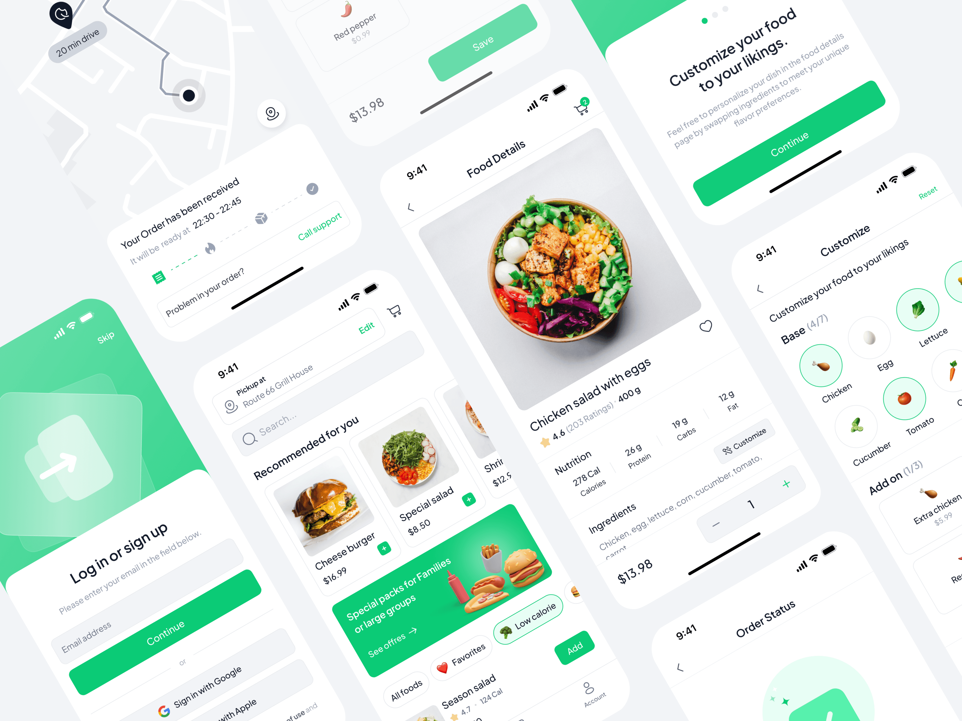
Welcome to ‘Quick Bite’—a concept for a food ordering app from a large fast-food chain.
This idea was born during a course on UX Design, run by Google. The aim of ‘Quick Bite’ is to give people healthy meal choices, quickly and easily, right from their phones. It’s perfect for those with a busy lifestyle who still want to eat well.
This project tells the story of how ‘Quick Bite’ was created to make ordering food a better experience by focusing on health and speed. We’ll go through this journey step by step, from the first ideas to the final design, keeping things straightforward and easy to understand.
My role
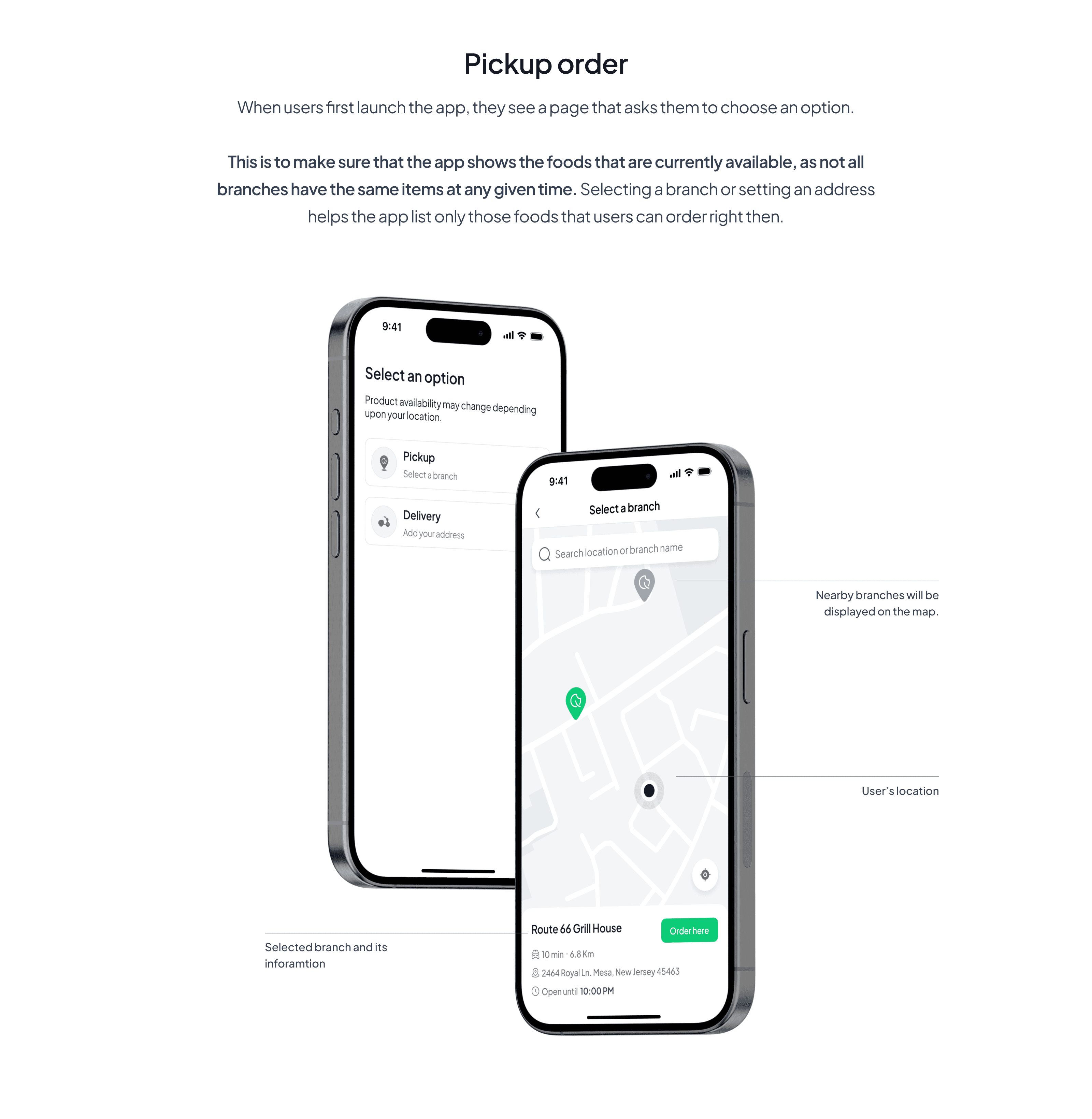
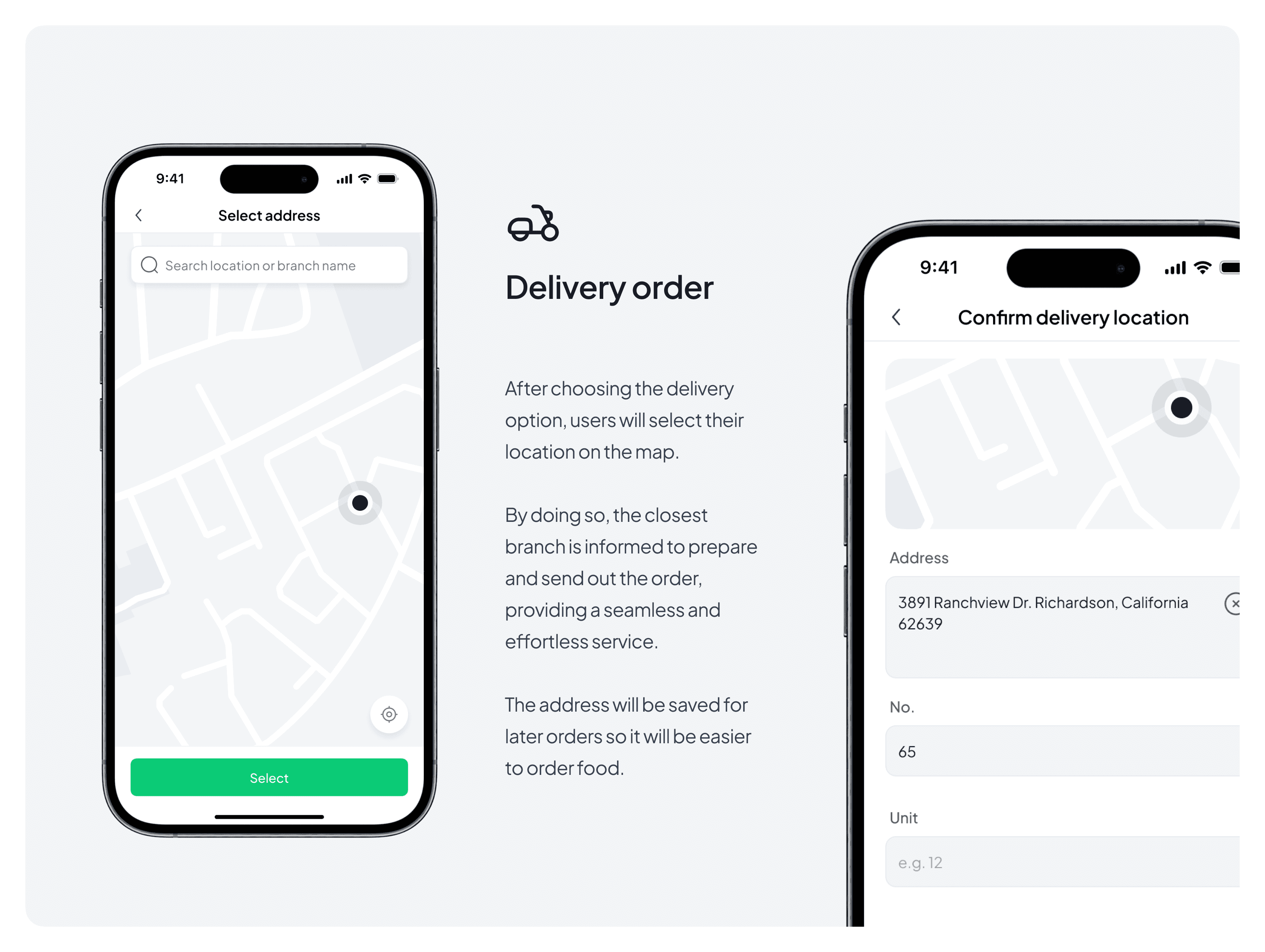
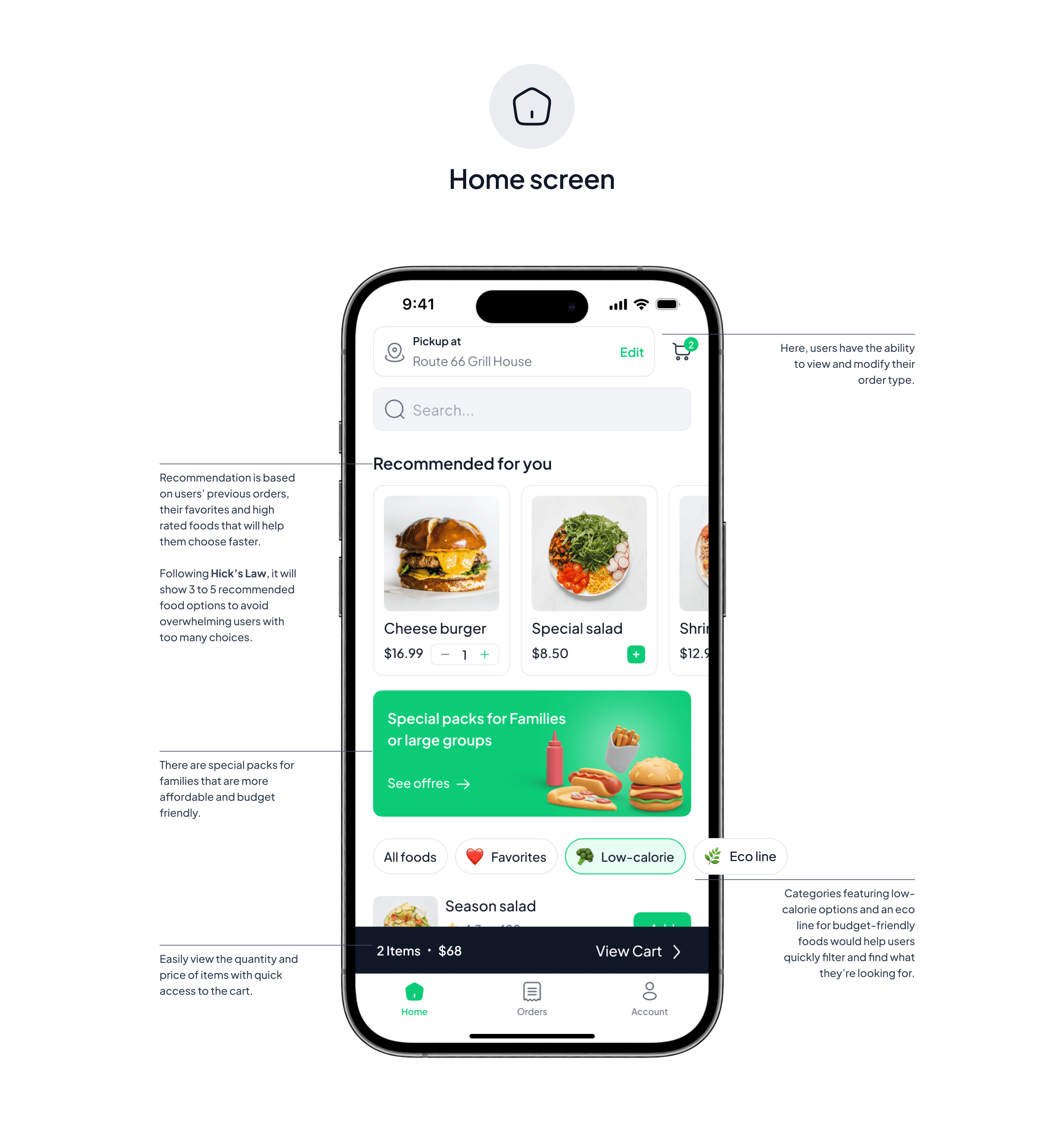
I worked on the project with a user-centric approach, first conducting user research and developing low-fidelity wireframes. After conducting usability studies and gathering user feedback, I designed the final visual interface of the app to be intuitive and user-friendly.
The problem
Users struggle with slow service, overwhelming menu choices, and a lack of customization in their meal options, along with insufficient nutritional information, making it difficult to make healthy and personalized food decisions quickly.
The goal
‘Quick Bite’ is here to speed up food orders while keeping it simple.
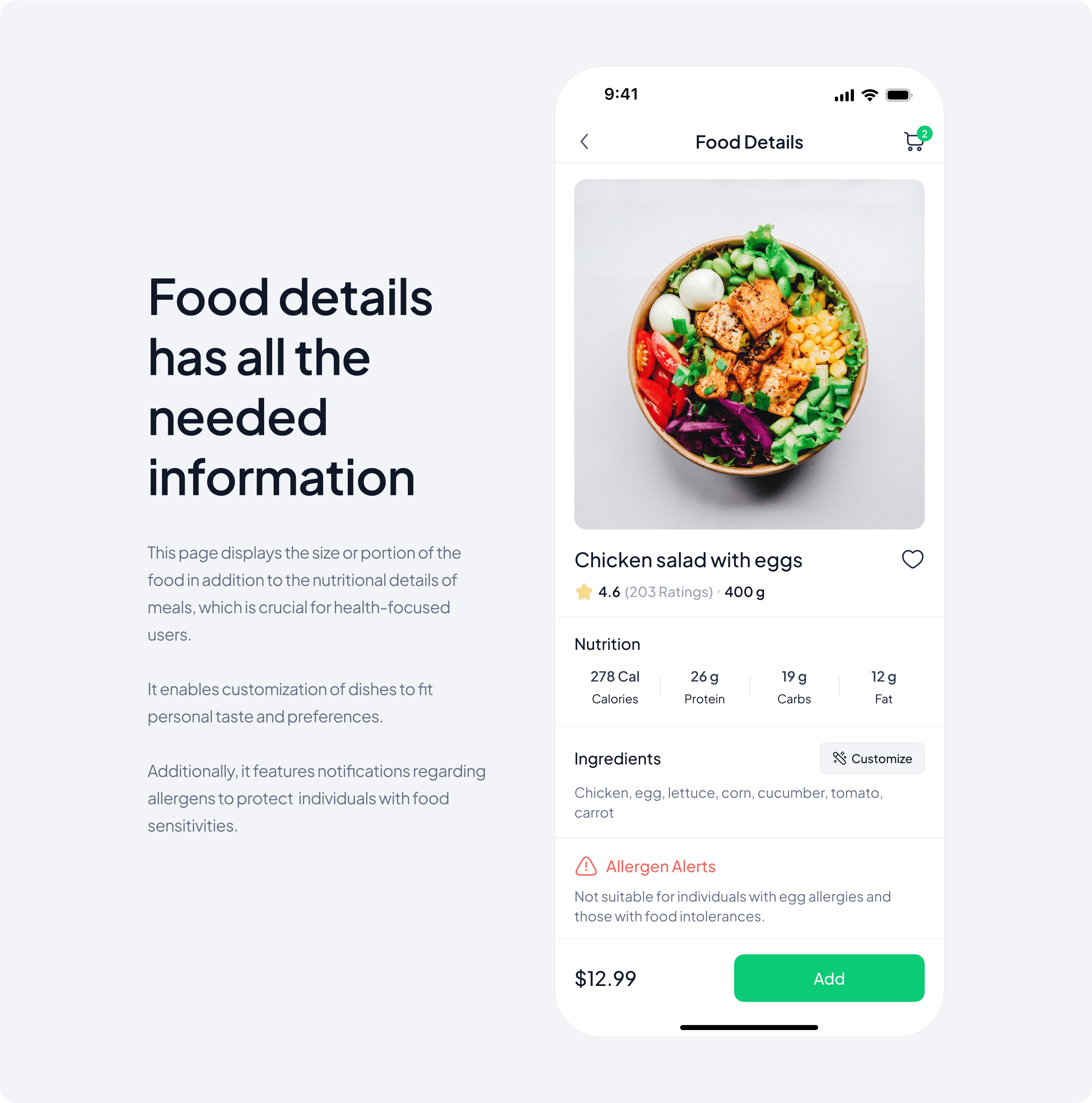
It offers food customization options and transparent nutritional information for informed choices.
The process
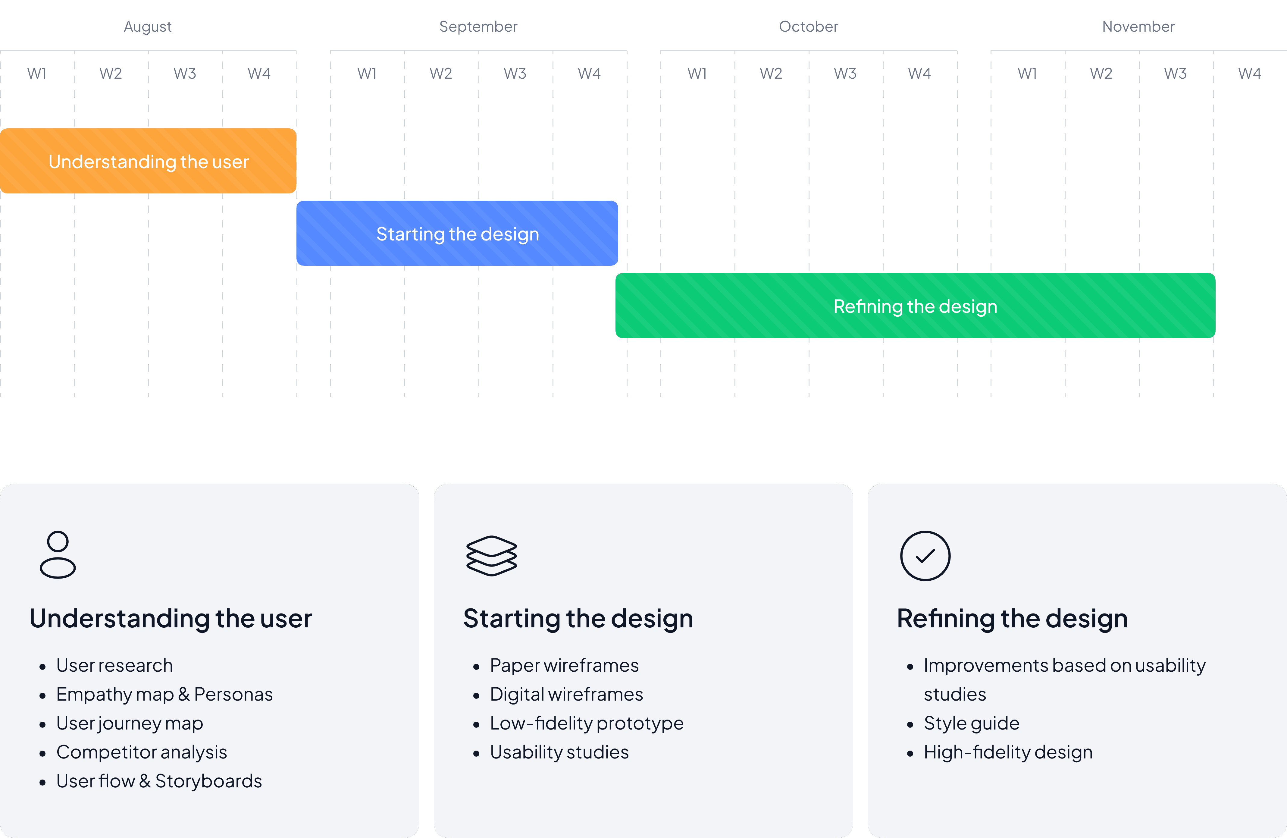

User research: summary
In this project, I started by conducting qualitative research. I set out my goals for this part to have a clear mindset about what I was looking for through this process.
How the users order food? What are the steps?
What feeling they have through each step of ordering?
Do they ever experienced any problems during the ordering food?
Is there something they wish they had or they want it to be different through this process?
What do they suggest to make this process easier?
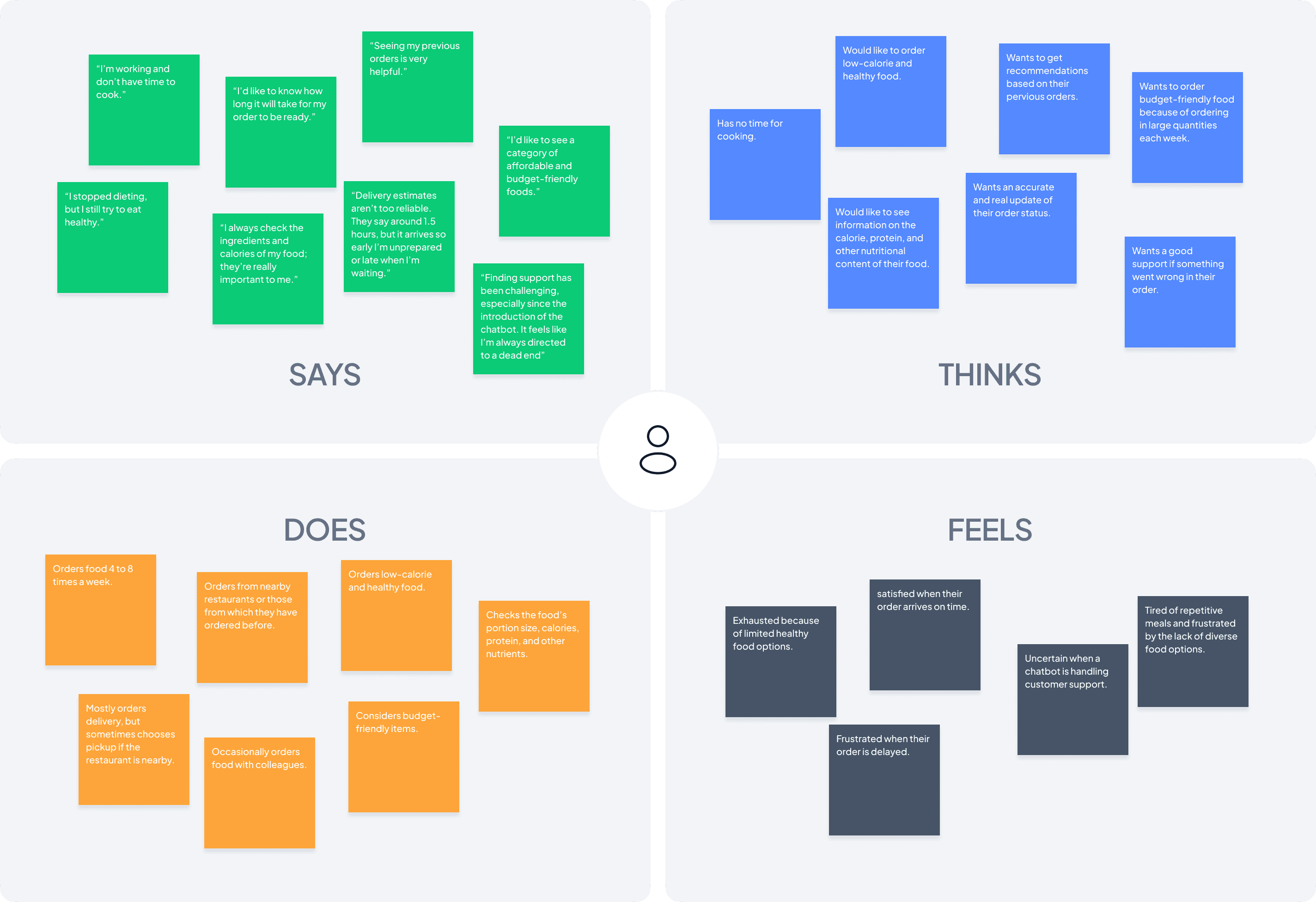
After conducting interviews, I designed empathy maps for each user, and then I managed to find shared patterns and designed an aggregated empathy map that you’ll see in the picture below.
User research: pain points
After creating the empathy maps, I identified four main pain points of the users.
Limited Healthy Options: Users struggle with finding diverse healthy meals. Adding a ‘low-calorie’ category in the app makes it easier for users to discover healthier meal options quickly.
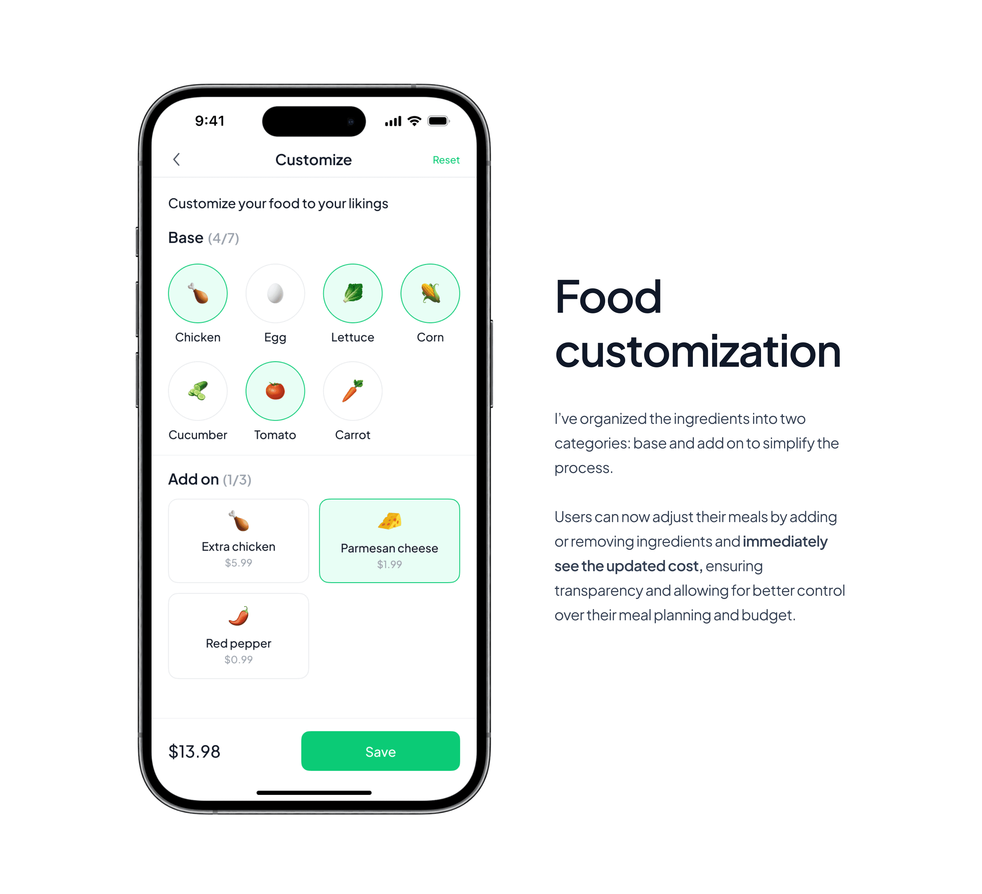
Lack of food Customization: Users face challenges without a food customization feature. Introducing this feature with clear options and real-time updates will enable users to effortlessly personalize their food to their preferences.
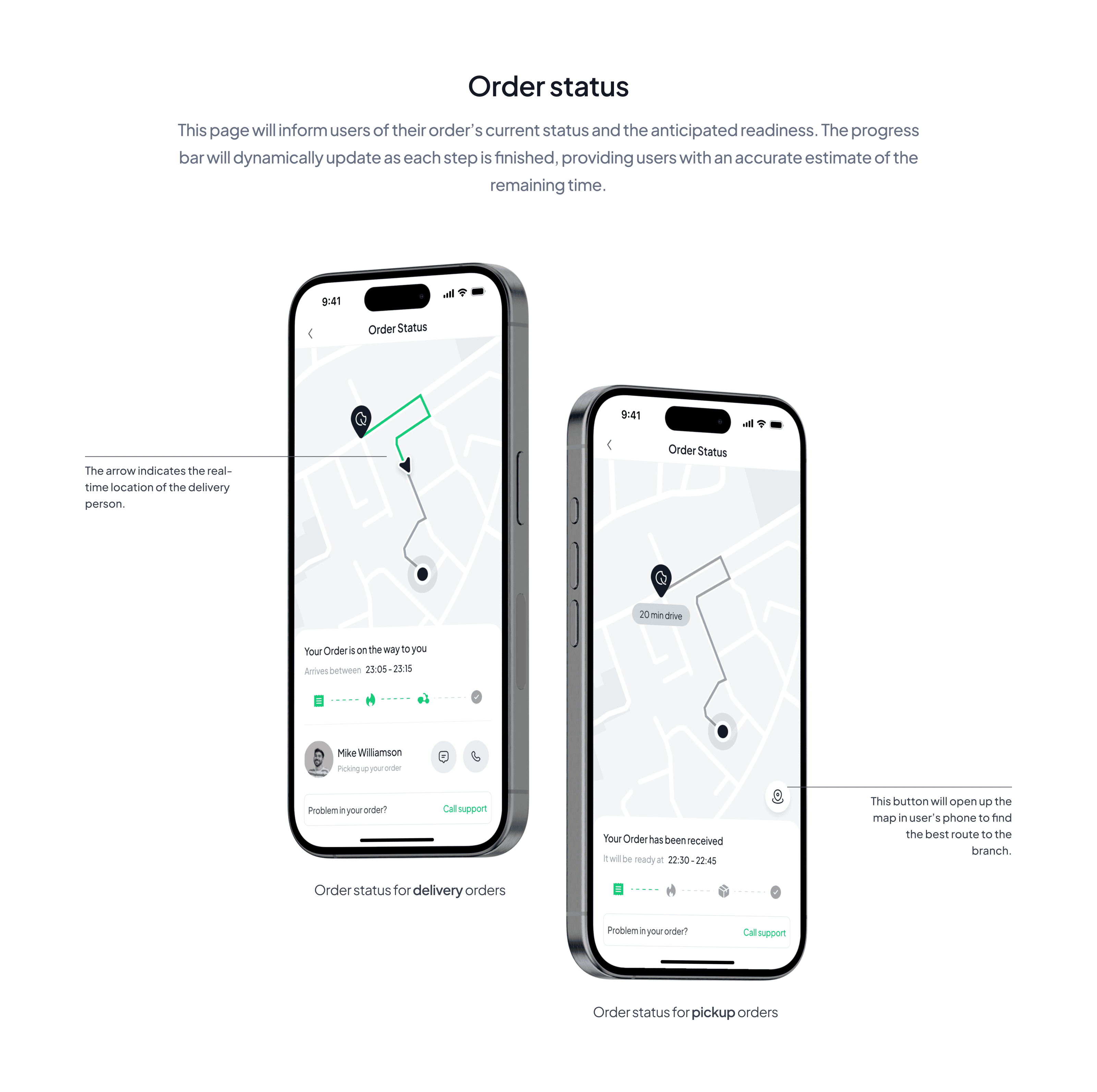
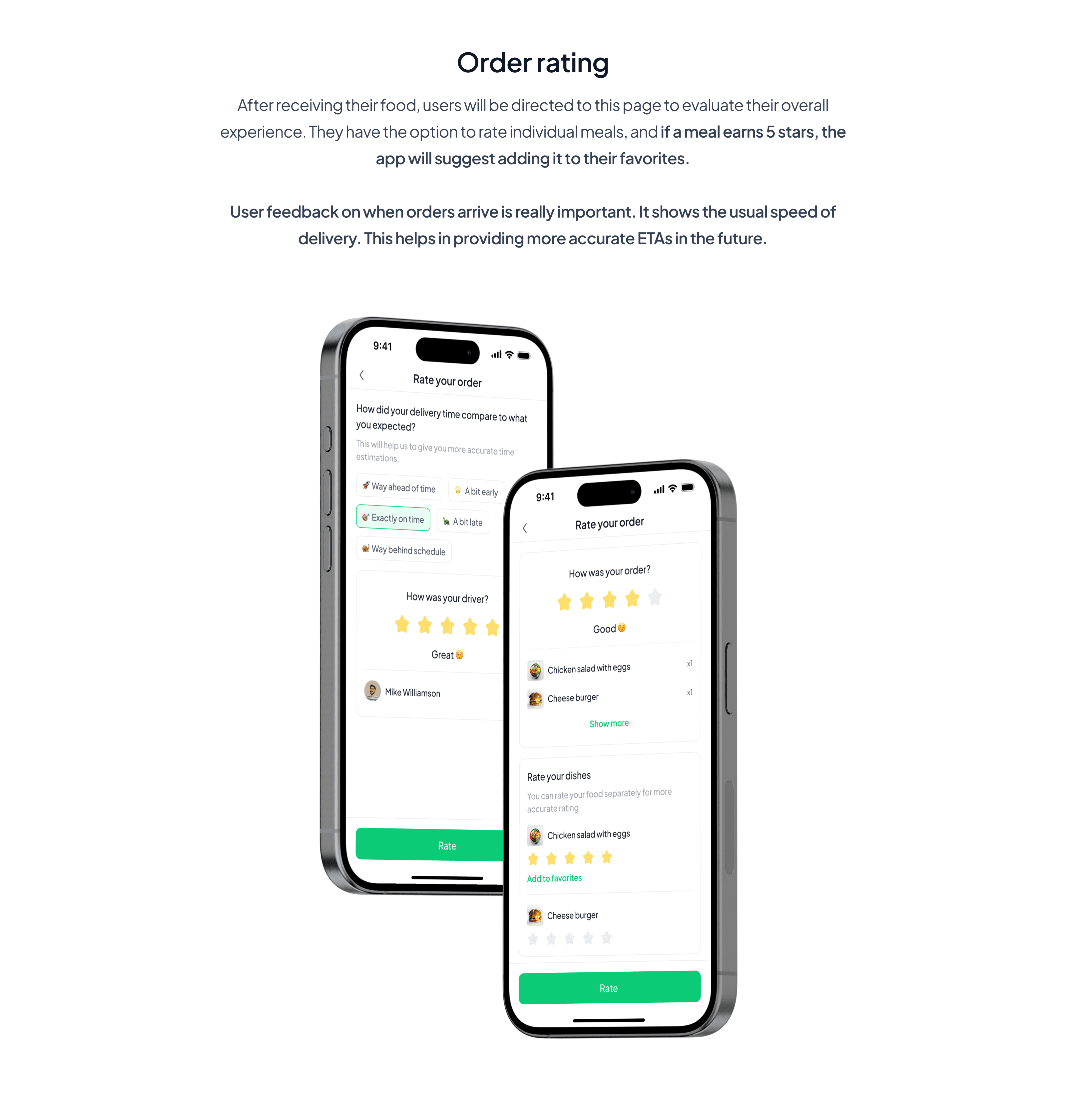
Inaccurate Time Estimates: Inaccurate delivery times cause issues for users.Our order status page updates delivery times in real-time, providing customers with accurate information, and also collects feedback for improving future ETAs.
No Nutritional Information: The lack of nutritional information on food in the app is frustrating for health-conscious users. Offering a clear and detailed breakdown of nutritional content for each menu item helps users make quick, healthy choices.
Personas
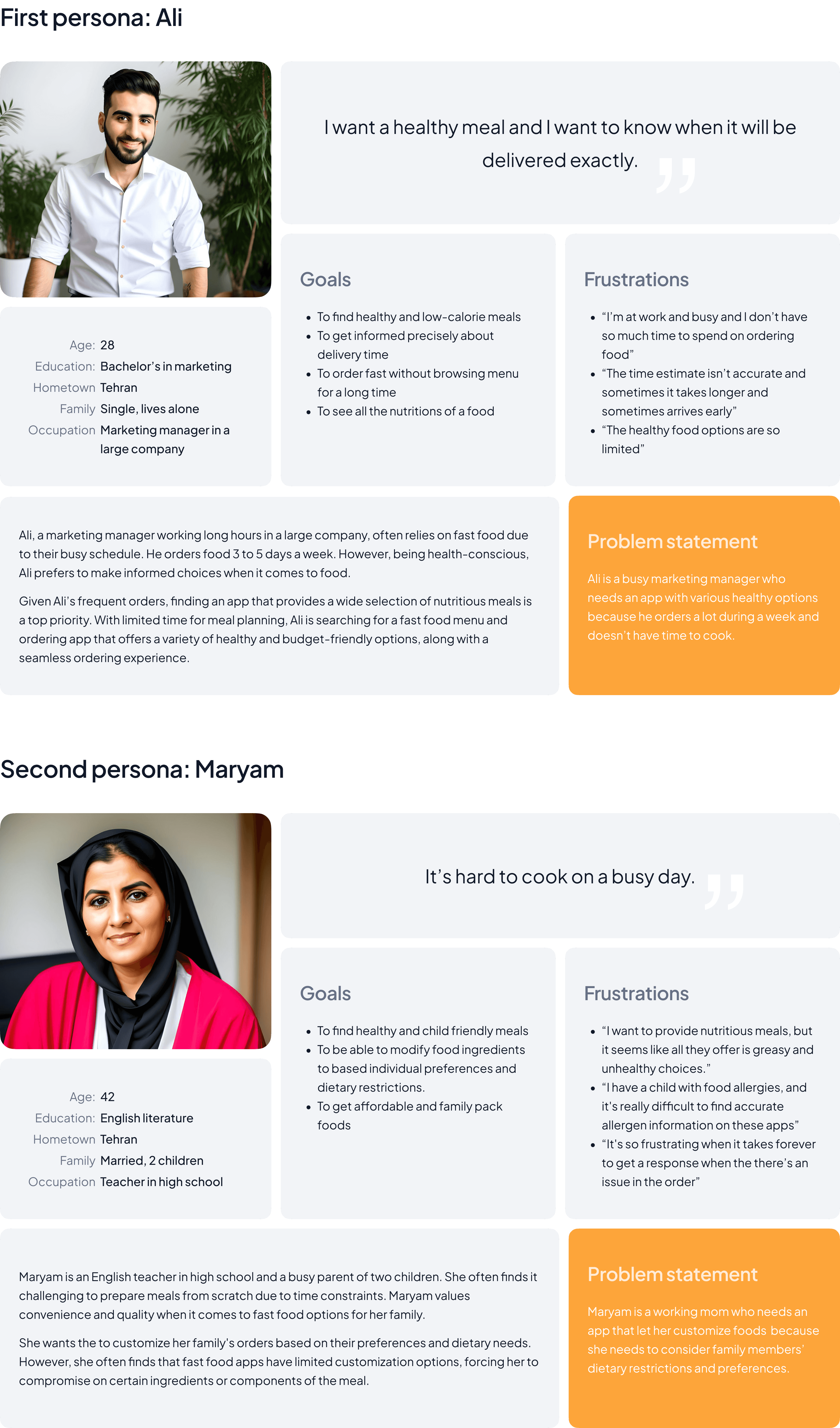
Now that I conducted research and have an understanding on users and their pain points is time for creating personas. In this part, I looked for the most common themes in the data and grouped the users who personify those themes together. This is how I created Ali and Maryam that you’re about to meet.
(I used AI for generating the photos.)
Journey map for Ali
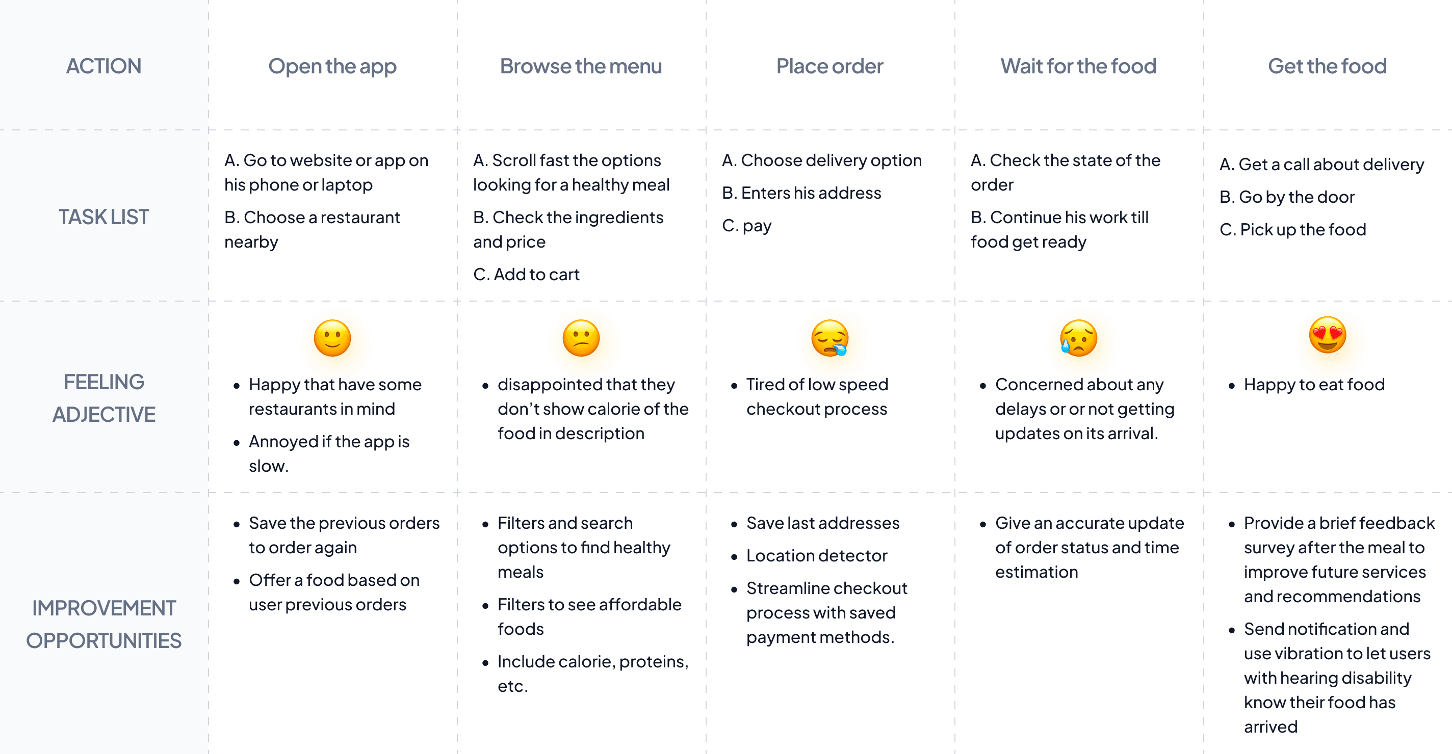
After creating persona is time for journey map. A journey map is just what it sounds like, an illustration of what the user goes through to achieve their goals. The most important thing about journey map is that helped me to design a obstacle-free path for users, and identify improvement opportunities.
Goal: Order a healthy and low-calorie food as fast as possible
Competitor Analysis
I checked out three different companies, including both direct and indirect competitors, to see their user flow, navigation, and UI. I’ve put my findings in a simple table down below.
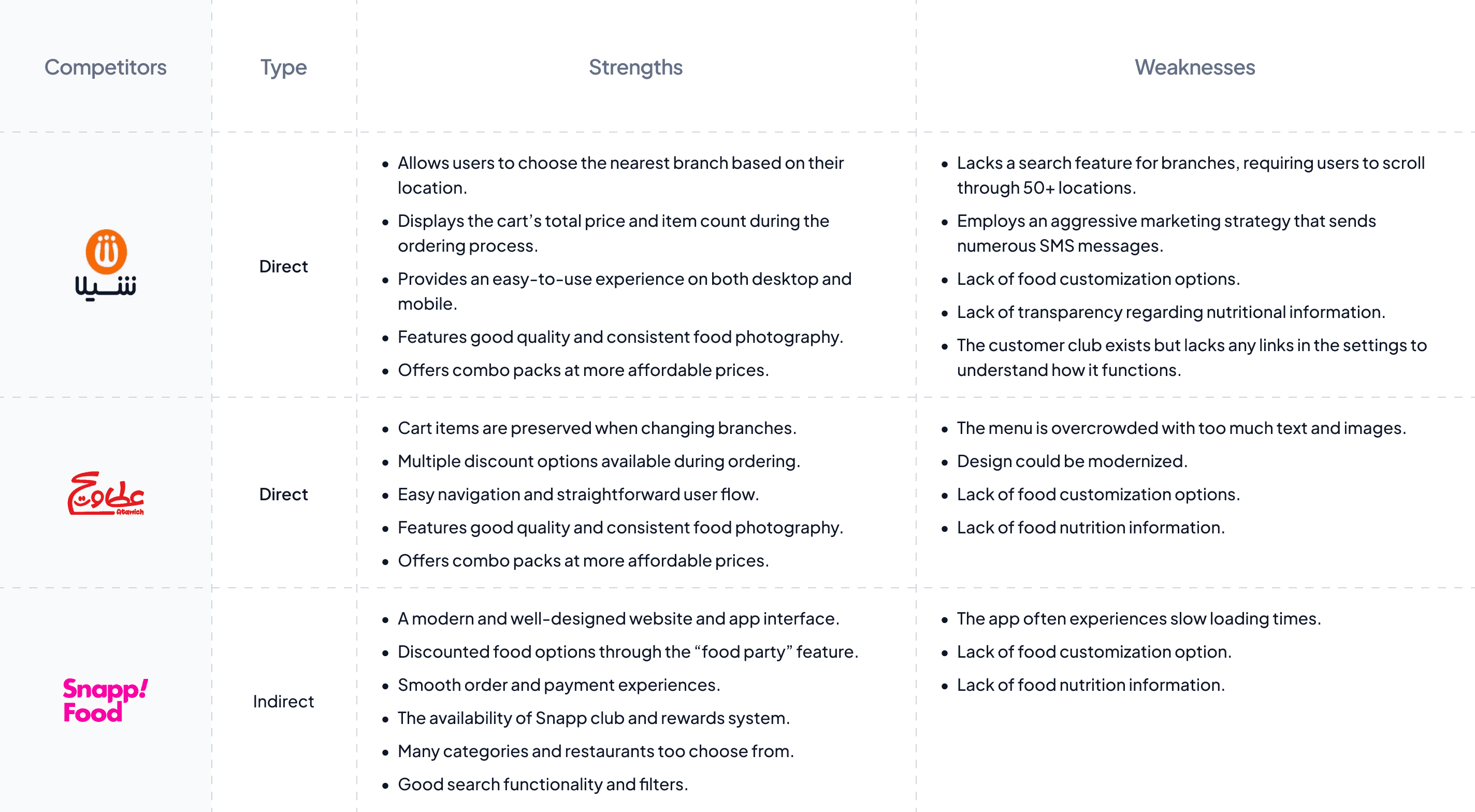
This part of project helped me to come up with ideas for how to ‘Quick Bite’ can do better. One of its key advantages is its ability to recommend dishes to users based on their past orders and ratings. ‘Quick Bite’ also stands out by giving users complete freedom to customize their meals to their liking, and being transparent about nutritional information.
User flow
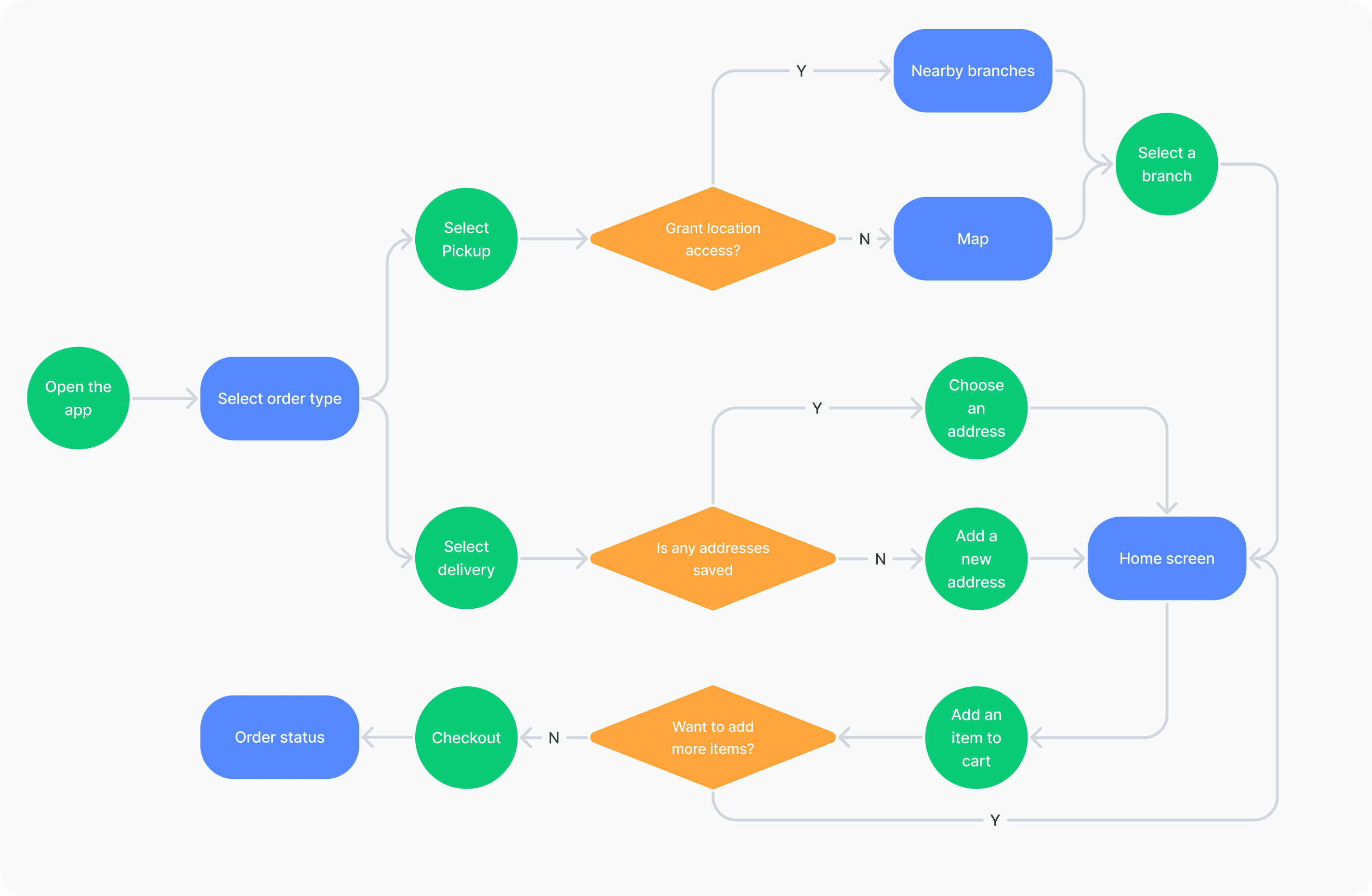
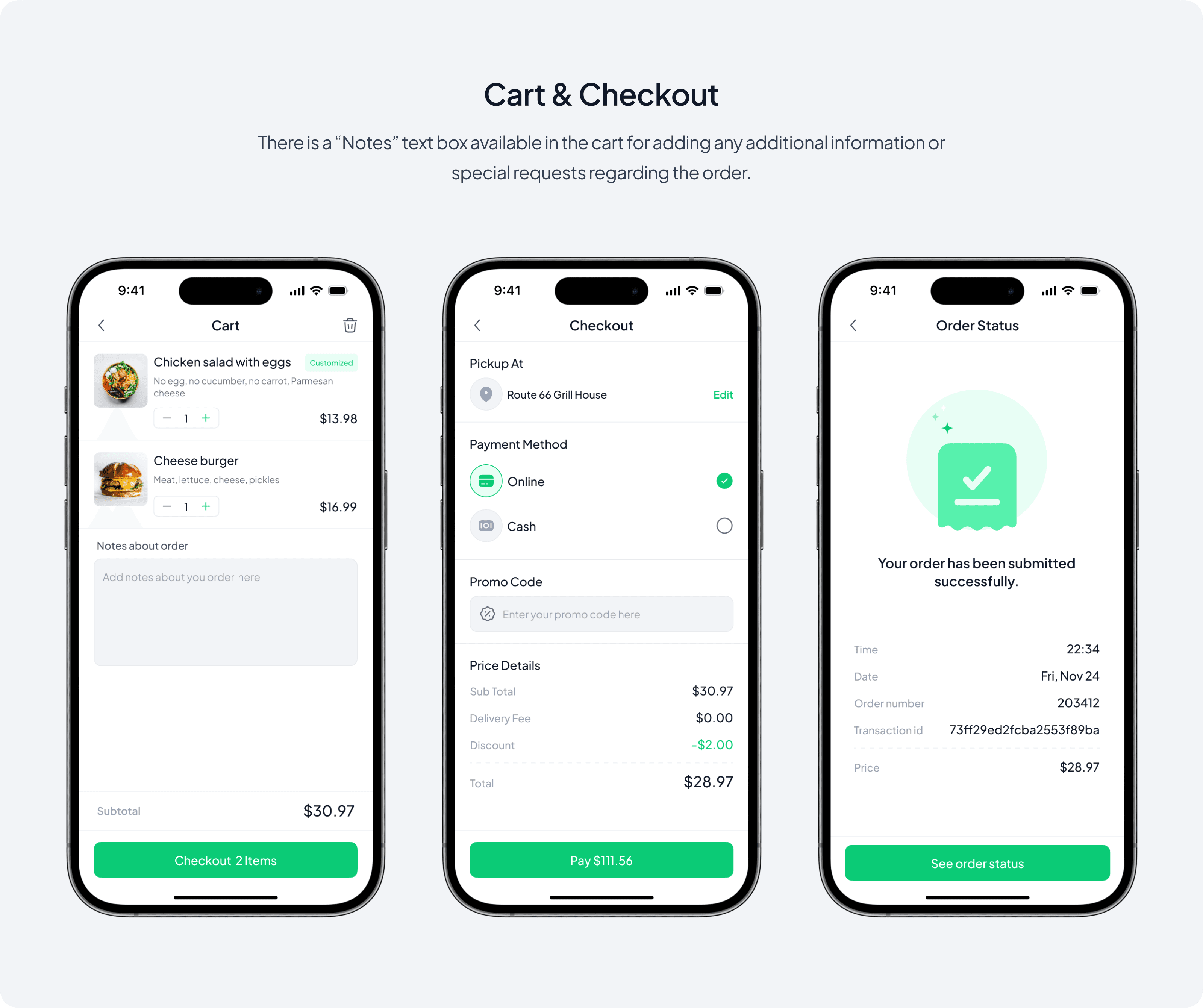
I designed the main flow of the app which is ordering food.
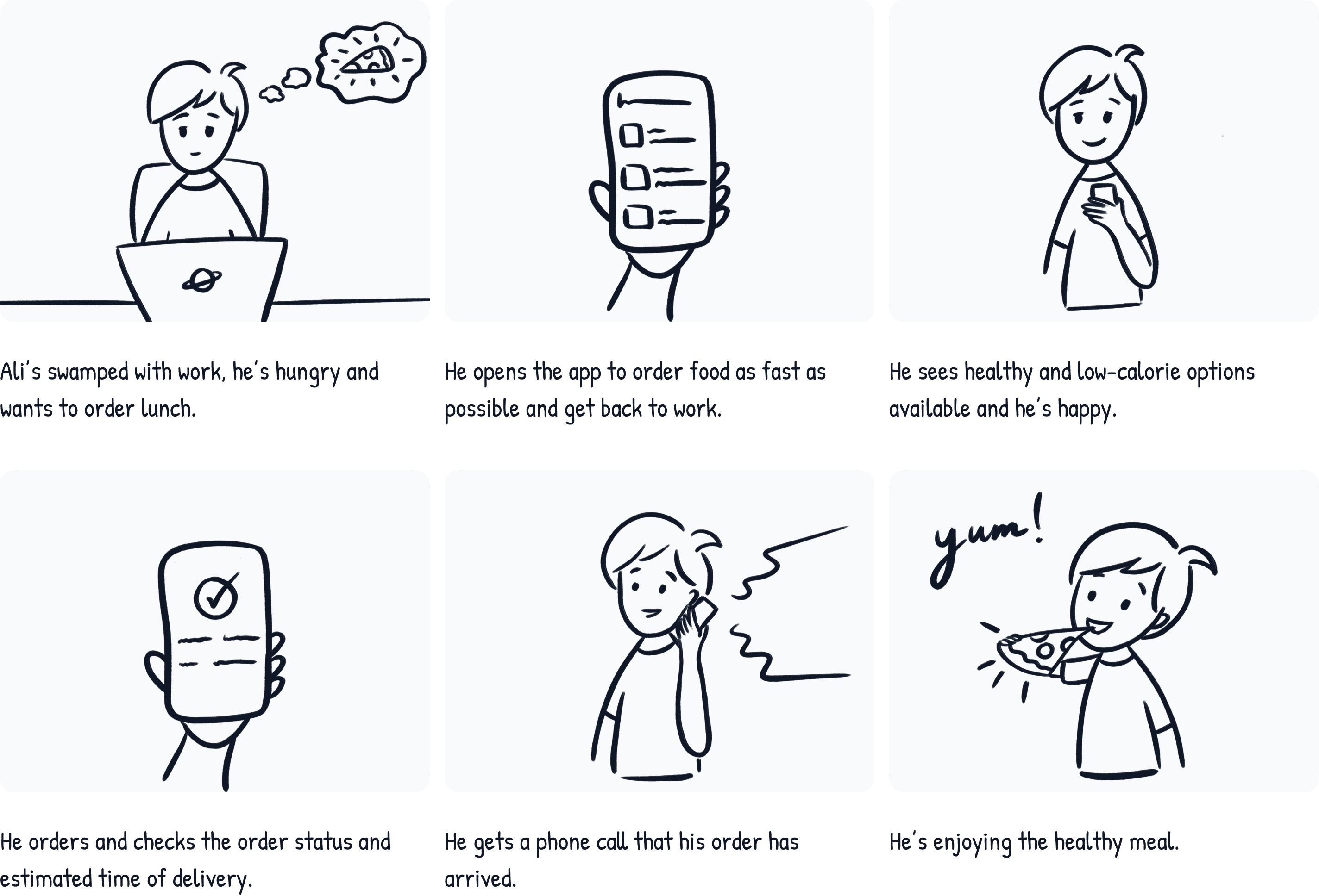
Story board — big picture
Once I’ve gathered insights about users’ needs, behaviors, and pain points, I was ready to start storyboarding. Big picture storyboards illustrate how users would interact with our product in a real-life context, focusing on their emotions, needs and pain points.
Scenario: Use the app to order a healthy food quickly
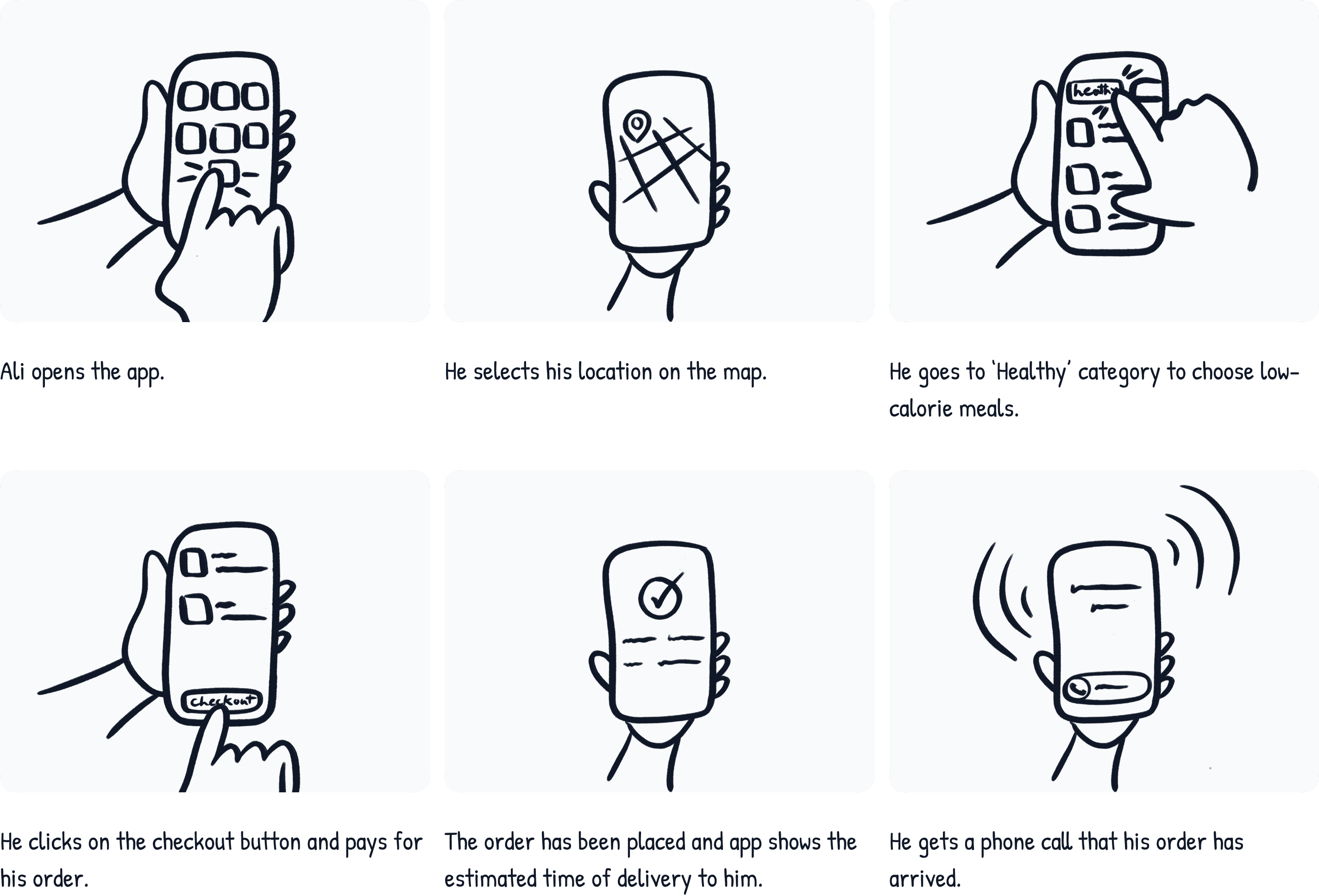
Story board — close-up picture
While big picture storyboards focus on the how and the why, close-up storyboards focus on the what. Close-up picture storyboards show product’s functions rather than the user’s experience, sh how to navigate from one screen to another.
Scenario: Use the app to order a healthy food quickly

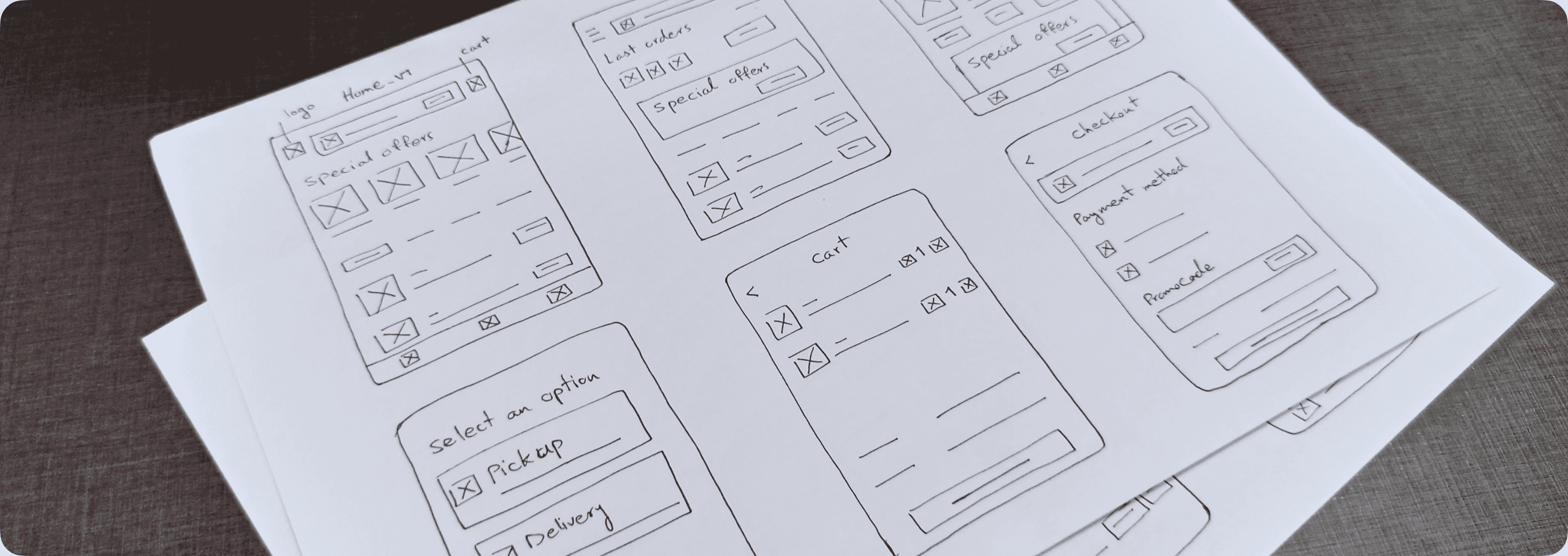
Sketching ideas on paper is a really handy way to get your creativity flowing without spending lots of time on complicated designs.
My goal when I started sketching was to come up with loads of designs in a short time. This way, I could see which ideas worked best without getting too caught up in the details.
The more I sketched, the better I got at spotting what would work for users and what would just make things confusing.
Digital wireframes
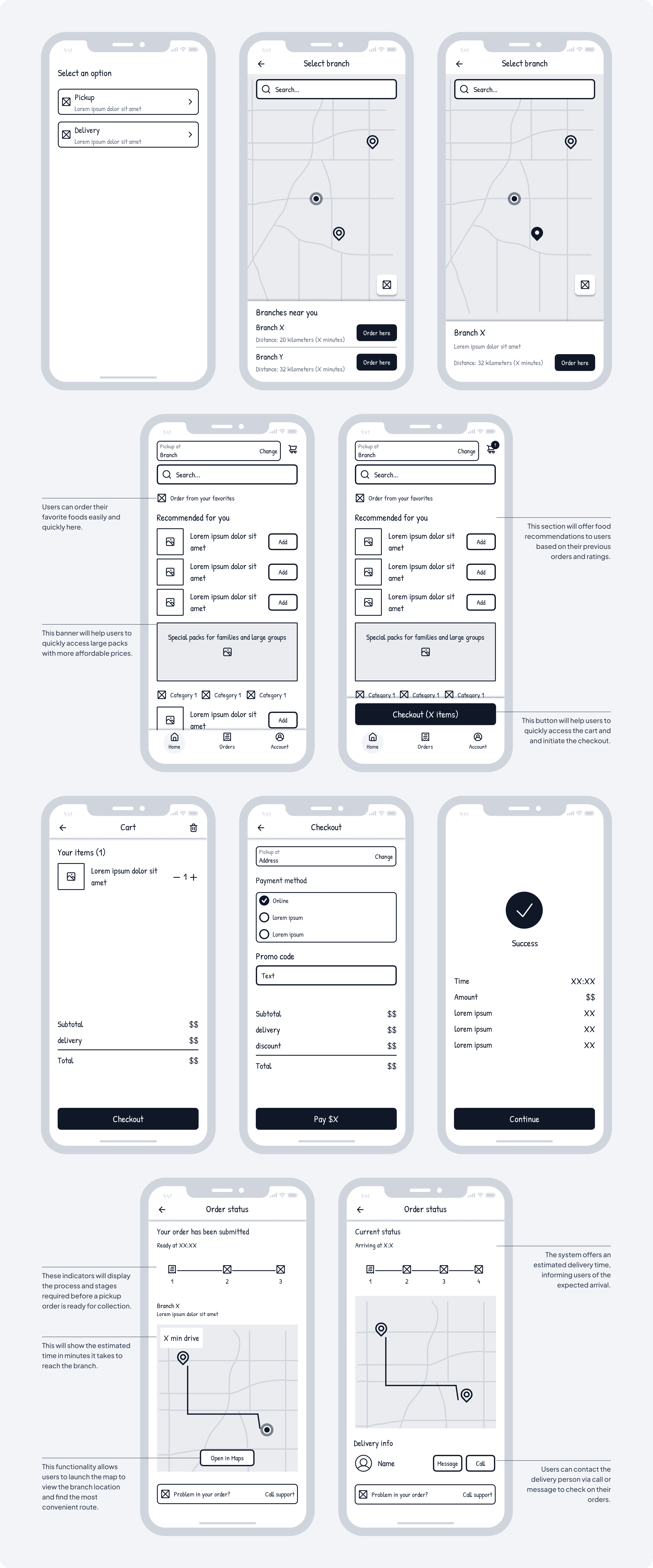
I created digital wireframes to enhance the accuracy and flexibility of adjustments in early design stages.
These wireframes are foundational for a transition into the creation of high-fidelity designs, and interactive designs for usability studies.
Usability study
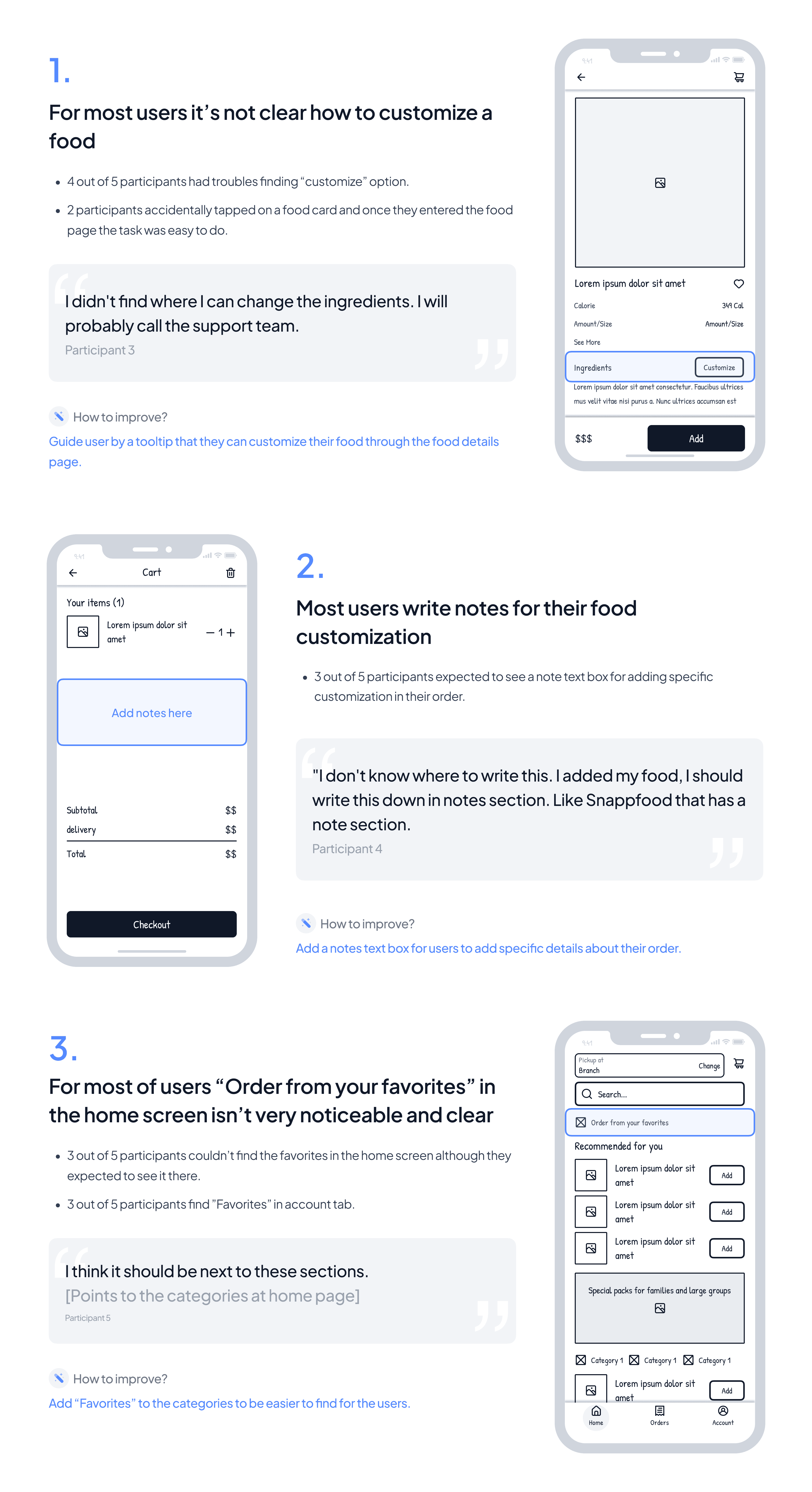
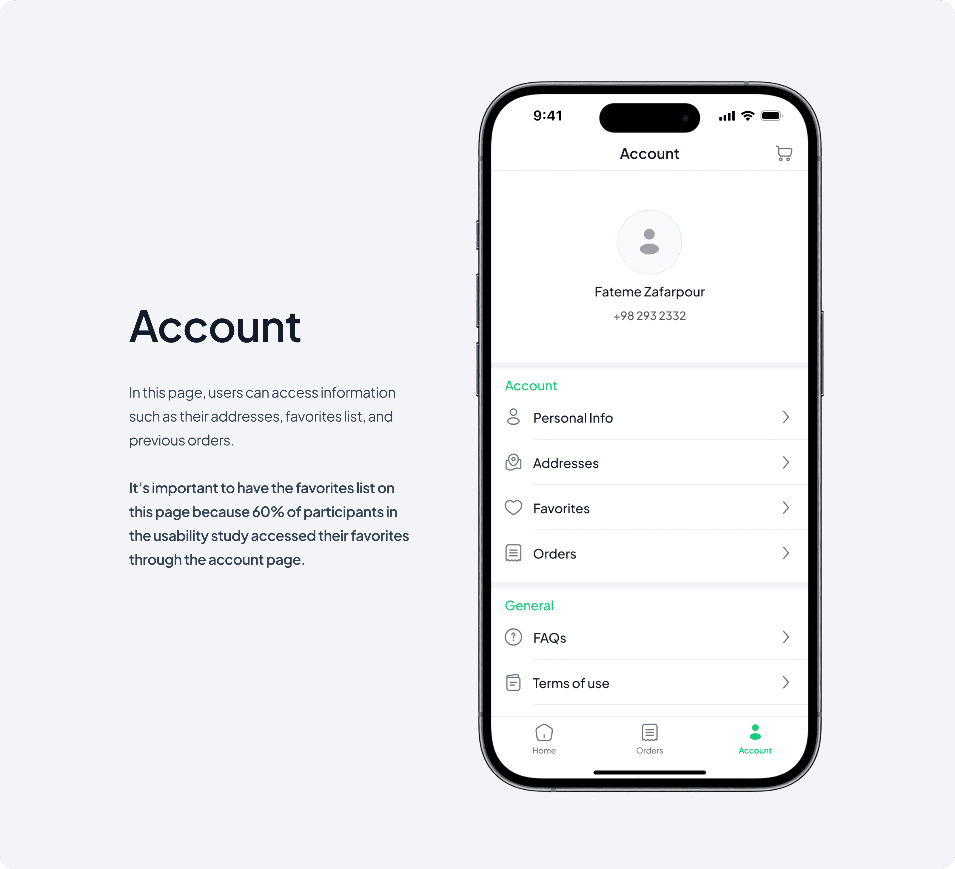
After prototyping these wireframes, I conducted a usability study with 5 participants who have the same characteristics as the personas. I decided to conduct the study unmoderated so that participants could complete tasks on their own time and in their own space, making it easier for them to provide accurate feedback.





What I learned
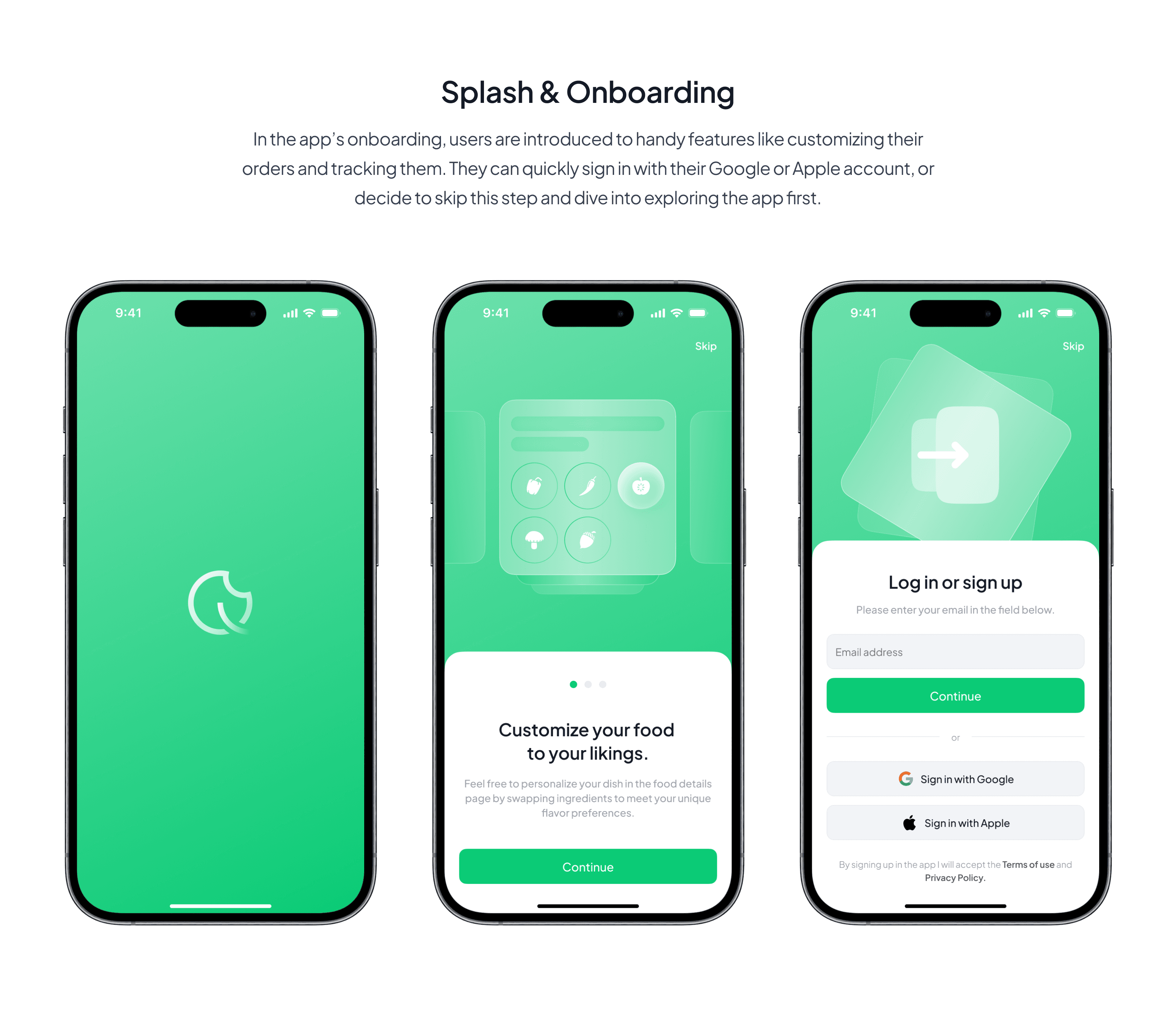
In the project, I conducted user interviews, competitor analysis, created low-fidelity wireframes, linked them to a prototype, performed a usability study, and designed high-fidelity UI screens successfully.
I’ve gained a lot in this process, but I know there’s still room for improvement and more lessons to learn as I continue to grow in this field.
